Updog Bodies AB.
Increasing membership retention for Stockholm yoga studio
Redesign of landing page including updated navigation, UX writing and user interface elements.
👩🏻🦰 My Role
UX / UI Designer
UX Writer
⏳ Duration
January 2024 - March 2024
🛠️ Tools
Figma
Pen & Paper
Context
🚀 Motivation
UpDog Bodies AB is a yoga and wellness studio that offers classes and events for youth and adults in Stockholm’s archipelago.
I chose to help this business because I was inspired by their commitment to improving wellness in the community. This redesign project presented complex problems which I enjoy solving.
🚩 Problem
The client wanted to increase retention and membership and worried that their landing page’s bounce rate of 58% could indicate possible usability issues with the user experience design and content design.
The current design has several issues impacting the overall user experience. These issues range from inconsistent visual design to over-complex navigation and content.
🎯 Business Goals
“As a business, I want increased memberships and retention in the studio/website.”
“(I want) easy navigation to all courses, classes and events on the website.”
👩🦰 Designer Goals
Help UpDog Bodies achieve their business goals by re-designing their landing page while also identifying user pain points. Combining these goals into a final solution that benefits the business and its customers.
Final Designs
Before
Landing page
Problems
🚩 1. Ineffective hero section
Here
Top navigation is too complex with 11 links. Customers have difficulty knowing where to begin.
A clear call-to-action is missing in the hero section.
🚩 2. User interface is confusing
‘Event’ and ‘Course’ text boxes appear to be buttons. ‘Learn More’ button appears to be a text box.
Gestalt law is broken. Spacing between images and text makes them appear separate from each other.
🚩 3. Inconsistency in design system
Active/pressed state colors are inconsistent.
Typography includes too many fonts and sizes which affects readability.
Button shapes are inconsistent.
🚩 4. Some elements are not accessible
Color contrast fails WCAG 2.1 AA compliance.
🚩 5. Text impacts cognitive load
Text is lengthy (surpasses 75 characters per line) and centered which affects readability.
Sentence complexity impacts readability. Reading level is above grade 9 which may be losing customers.
Discovery Research
Competitor analysis
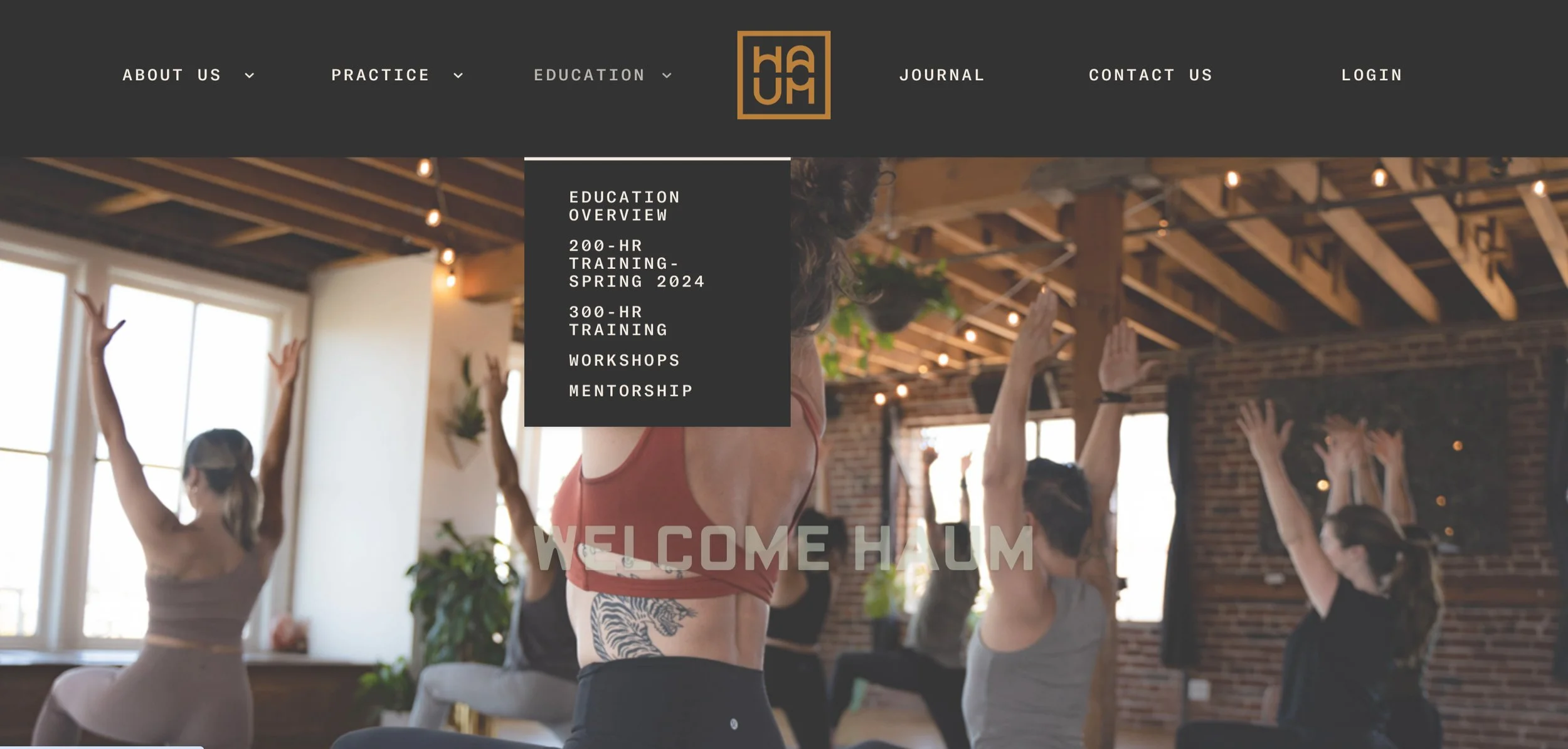
To determine opportunities for UpDog to stand out from the competition, I looked at several yoga studio websites in Stockholm, New York and San Francisco.
Research insights
Fewer navigation links (5-6) could make navigation easier.
A call to action for booking or buying a pass could make booking easier.
Business mission, studio details and instructors info could help build trust with users.
Changing the way classes are presented on the landing page could increase interest.
Moodboard
Light, airy, positive, clean and trustworthy
The owner and I agreed the color palette and fonts should stay the same since they communicated the brand’s aesthetic well.
This aesthetic was missing on many competitors’ pages, which seemed like an opportunity for UpDogs.
We agreed to keep the look and feel of the brand but that I would redesign buttons to add consistency and accessibility.
Ideating
Low-fidelity wireframing
To meet customer and business goals, I added:
📢 Clear call-to-actions to book a class or explore classes
🪧 Simpler top navigation with 5-6 links
🤝 Credibility via storytelling in two new sections:
Our Story
Our Practice
A new problem emerges
❌ The business owner wanted the design to include a large selection of classes and workshops on the landing page. However, on the original page there were many classes which were close together and disorganized. This led to cognitive overload (below).
✅ We needed an effective way to showcase classes without crowding the screen, so I designed a carousel that would showcase UpDog’s most popular offerings. The carousel could attract customers by sparking interest without info overload, and give them a feeling of freedom and control.
Experimenting in high-fidelity
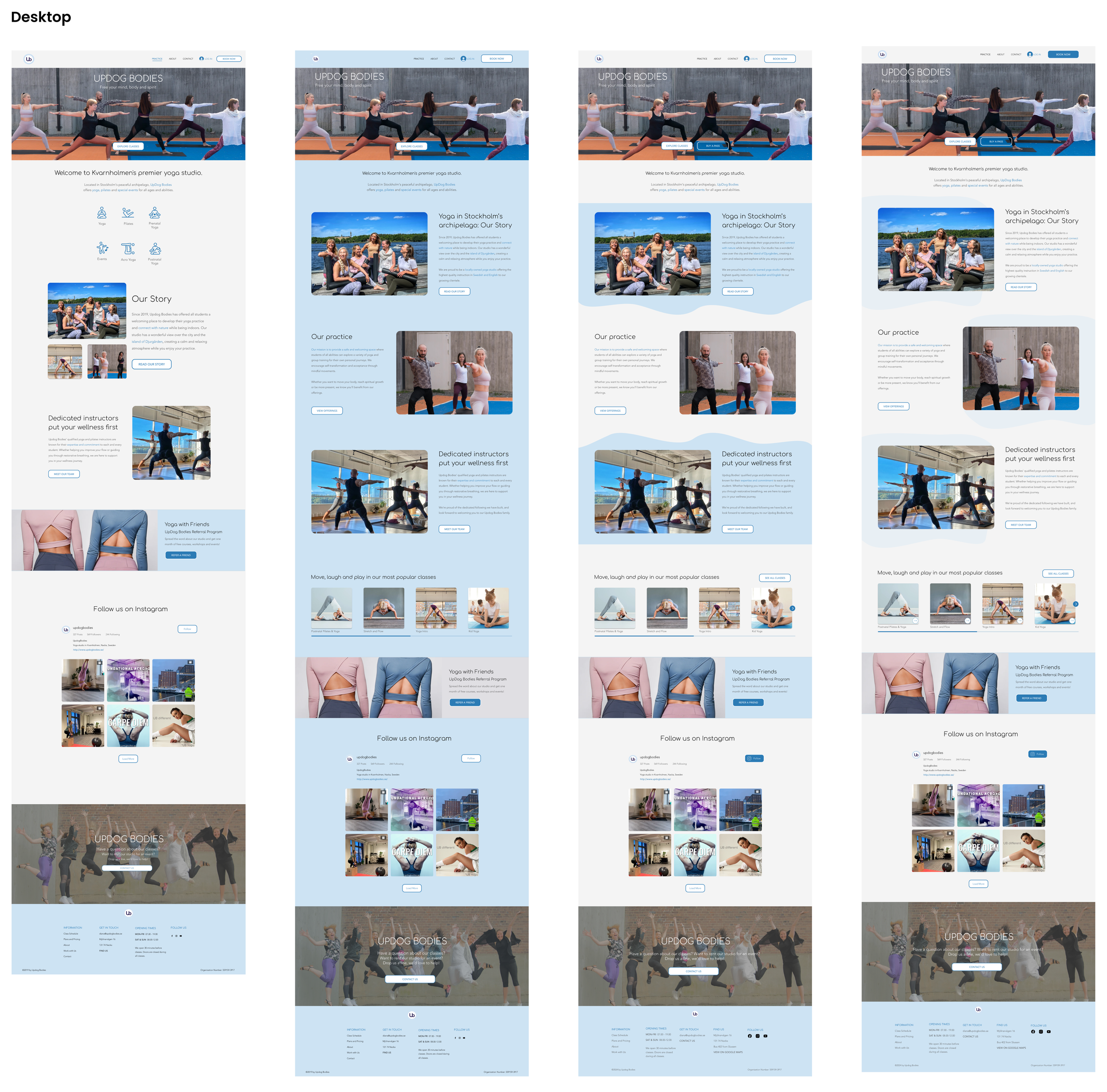
🌊 I played with the desktop design to add more visual interest and a feeling of flow and water that connected with the location of the studio.
🎓 I removed icons and replaced them with three storytelling sections to build credibility with new customers.
✏️ I added new, simpler copy and microcopy.
Experimenting with different layouts
Updated Style Guide
🪄 The updated design system now had consistent and accessible buttons that are compliant with WCAG 2.1.
Deliver
Final designs
Next Steps
Usability Testing
Design Booking Flow
Design Onboarding and Account Creation Flow
Learnings
💸 Identifying usability issues on a budget. Due to the timing of the project beginning over the holidays, along with budget constraints, I didn’t have access to test participants for interviews. I learned that conducting a heuristic evaluation can help spot issues when access to participants is limited.
✍️ Content drives design. During this redesign I worked on improving written content as well as the UX/UI design. I learned how important the role of a content designer is, as visual design is driven and impacted by content.
🙅🏻♀️ More is less. This project often made me focus on the paradox of choice. We want to give users choices, but when the amount of choices becomes overwhelming, it can be detrimental to users’ decision-making.


